Thursday, 22 January 2009

Christmas Cards for Textiles Fundraising


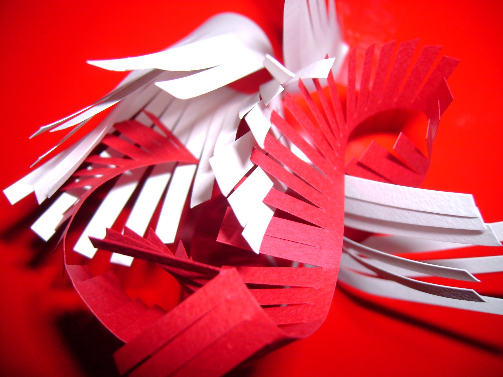
Textiles students at BCU are asked to raise money in their final year for the degree show held in June. Each specialism has to raise about £1000 to pay for business cards and promotional materials, the show and transport to the Young Designers show. These cards were my contribution to the christmas craft stand. They were influenced by my dissertation subject; popular culture imagery and given a festive feel!


Wednesday, 21 January 2009

Global Colour Collaboration

Birmingham City University has linked up with UBM Live, the exhibition organisers behind Interiors Birmingham, and forecasting agency Global Color Research – mix publications, to present the future trends of the interiors industry. Students were briefed with one of four trends predicted by global colour and asked to develop and create products and imagery fitting with their trend.
My tutors gave me the trend "Punch"!

Reds: luscious lipstick colours, red browns, red foils, especially classic pillar box red. Punch is completely co-ordinated tonal interiors, based on tonal variations of one colour, a strong forward trend creating maximum visual impact. This trend involves clean slick lines, simple arresting shapes, lack of detail, air-brushed perfection, pared down unromantic but maybe dangerously sexy, racy, brash, fun design, 80’s bling, graphic, kitsch, tonal, and conceptual. This is not a decorative trend but one of high impact, think red Ferrari and cocktail cherries - strong structural glossy shapes.


Interiors Birmingham 18th-21st January

Below is the Punch trend on the Global Colour stand at the NEC'S Interiors Show 2009.


For the show several students works were utilized to create stands that depicted what each trend was about. For Punch I created 250 origami birds and hung them at different heights to portray a flock of birds in mid-flight.


Origami Birds- Punch


Rather than starting with the sexy, 80’s bling part of this trend I decided to look at the more graphic, high impact imagery associated with “PUNCH”. Initially I wanted to look at strong, structural visual objects and the positive and negative spaces created within and around them. Origami know for its clean lines and interesting shapes was my route of choice.


I used different bird shapes that linked well with the image of the white bird cage placed against a red back ground in the Global Colour trend book.

Origami Flock


Working with the birds as my physical objects and developing designs through experimentation with wax, glue and glitter, it was easy to create designs for the strong visual trend. With the main aim of my personal take on the trend, being to create a wet, plastic looking visual image which almost gives the effect of the strong lines melting into a red gloop.


Punch Paper Manipulation


Drawing Approaches and Practices


As part of the second year curriculum an elective was chosen mine, Drawing Approaches and Practices, explored drawing materials and styles. These pictures are studies of the human form, skeletal structure and face, charcoal, pencil, chalk and ink have all been used as methods.