Thursday 22 January 2009

Christmas Cards for Textiles Fundraising


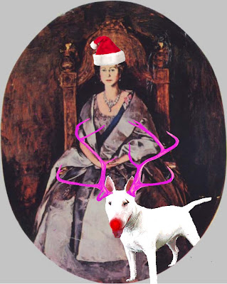
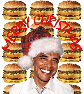
Textiles students at BCU are asked to raise money in their final year for the degree show held in June. Each specialism has to raise about £1000 to pay for business cards and promotional materials, the show and transport to the Young Designers show. These cards were my contribution to the christmas craft stand. They were influenced by my dissertation subject; popular culture imagery and given a festive feel!



Wednesday 21 January 2009

Global Colour Collaboration

Birmingham City University has linked up with UBM Live, the exhibition organisers behind Interiors Birmingham, and forecasting agency Global Color Research – mix publications, to present the future trends of the interiors industry. Students were briefed with one of four trends predicted by global colour and asked to develop and create products and imagery fitting with their trend.
My tutors gave me the trend "Punch"!

Reds: luscious lipstick colours, red browns, red foils, especially classic pillar box red. Punch is completely co-ordinated tonal interiors, based on tonal variations of one colour, a strong forward trend creating maximum visual impact. This trend involves clean slick lines, simple arresting shapes, lack of detail, air-brushed perfection, pared down unromantic but maybe dangerously sexy, racy, brash, fun design, 80’s bling, graphic, kitsch, tonal, and conceptual. This is not a decorative trend but one of high impact, think red Ferrari and cocktail cherries - strong structural glossy shapes.


Interiors Birmingham 18th-21st January

Below is the Punch trend on the Global Colour stand at the NEC'S Interiors Show 2009.


For the show several students works were utilized to create stands that depicted what each trend was about. For Punch I created 250 origami birds and hung them at different heights to portray a flock of birds in mid-flight.


Origami Birds- Punch


Rather than starting with the sexy, 80’s bling part of this trend I decided to look at the more graphic, high impact imagery associated with “PUNCH”. Initially I wanted to look at strong, structural visual objects and the positive and negative spaces created within and around them. Origami know for its clean lines and interesting shapes was my route of choice.


I used different bird shapes that linked well with the image of the white bird cage placed against a red back ground in the Global Colour trend book.

Origami Flock


Working with the birds as my physical objects and developing designs through experimentation with wax, glue and glitter, it was easy to create designs for the strong visual trend. With the main aim of my personal take on the trend, being to create a wet, plastic looking visual image which almost gives the effect of the strong lines melting into a red gloop.


Punch Paper Manipulation


Drawing Approaches and Practices


As part of the second year curriculum an elective was chosen mine, Drawing Approaches and Practices, explored drawing materials and styles. These pictures are studies of the human form, skeletal structure and face, charcoal, pencil, chalk and ink have all been used as methods.


Pattern Textiles Placement


During second year at BCU students had the opportunity to take four weeks work placement with textiles companies. I travelled to London and worked with Pattern Textiles for two of those weeks. Pattern specialise in computer generated prints, embroidery and embellishment, vintage garments, screen prints, hand-painted designs and t-shirts. Their designs are trend driven and magazine research and feed back from companies they sell to help them to establish design briefs. They also look to vintage designs for construction, detailing and print inspiration. For the other two weeks Pattern gave me a live project, below.

Brief:
To create fifteen textiles designs for a women’s wear collection using the chosen colour way, above. The collection will be for autumn/ winter and will include three different directions; animal print, floral’s and geometrics. Three final designs from each story should be made-up into garment swatches.

Animal Print Outcome

Animal print should be inspired by latest trends on the catwalk and how designers are currently using animal print should be taken into consideration. No more then three colours should be used.

Below is the final garment swatch for the animal print part of the brief.

Geometric Outcome


Geometrics should be influenced again by vintage fashion prints and ethnic designs. The prints should be created by building up colour with small drawn marks and strips should be worked into them. Four or five colours are to be used in the geometric prints.

Floral Designs


Floral Print Outcomes


For floral, vintage fashion prints should be researched, looking for a strong style. Blocks of colour mixed with mark making techniques to create flowers and leaves. Creating boarder prints as well as all over should be taken into consideration with the use of no more then four colours.


Urban Strain (Second Year Work)

Spring/ Summer Women’s wear will be a season of mixed neutral tones and bright colours, large scale motifs and asymmetrical designs. Feminine, vivid and fun describes these busy prints. Urban Strain is a street label aimed at 15-25 year olds which mixes urban fashion with pretty floral prints. Using fresh contemporary colours and a mixture of very large and small scale geometric shapes, many of the designs give an appearance of Ariel view cityscapes. Mapping, roads and skyscrapers all influence these bold prints. Designed for the underground and hip hop scene, it reflects the modern youth culture and a generation of individuals. Retro, vintage and casual fashion spliced and pieced together with a summery feminine sensitivity.

Urban Strain Development Work and Final Outcome


Fabric Samples


Fabric Samples


DisFunktional Origins (Second Year Work)


Autumn/ Winter 2008, is a season of fashion contradictions, with large scale garments confusing the bodies form, patterns and textures which are un-complimentary of each other, dull colours mixed with bright colours and large scale motifs mixed with busy patterns. DisFunktional Origins focuses on the effect which is caused when pattern, scale, shape and texture are seemingly thrown together at random. There is some reference to Afghanistan’s ethnical origins and the geometric designs have been taken out of traditional ikat weaves. The designs will focus on spliced, pieced and patched textures, as well as bold geometric jacquard, oddly positioned, incongruous print motifs. The colour is based on the idea of twilight, using an accent colour to stand out against a variety of dull colours, as if it were a light in the darkening sky. The dulled jewel colours used were taken from the jewel colours predicted for next autumn/ winter.

Screen printed fabric samples


Sketch Book Work


These drawings focuse on the geometric forms which are seemingly thrown together at random. The is a reference to the Islamic patterns found in their traditional clothes as well as the use of simple geometrics, which reflect the mix of culture this trend is representing.